
I just wanted to ensure that i didn't offend anyone in my last challenge post about matching photos to paper.
As i quoted from the one and only Ali Edwards in one of the first posts on this blog 'THERE ARE NO RULES!'
While i still stand by this, i was going to scrap today and was looking through my stash to find *the paper* (as you do) and found that i could illustrate my point of losing the photo in the matching paper.
I have taken some photos to demonstrate but if you scrap this way you need not read on. Everyone does things differently and that is A-OK :)
This first image is a direct match of the pink of the shoes to the pink in this Basic Grey paper. Very similar tones, it all matches in and nothing really pops out. The photo is almost lost in the 'pink-ness' of it all.

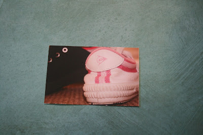
The second image is with teal paper (i am loving teal at the moment!!) and is a direct contrast to the pink. In actual fact NOTHING matches with the teal and yet the photo is popping right off the page! You could do the 60:30:10 rule here and put a splash of pink and black and i think that page would totally ROCK!
The last image is showing how i have used green paper (again Basic Grey) which has a few tinges of pink through it. I really love how this is kinda matching the photo and yet isn't overwhelming it.

I am not a big fan of using colour picking tools (my eyes are my tools but again whatever works for you!) but i have included the colour wheel here to demonstrate the bottom two background colours are COMPLETE OPPOSITE to the pink colour in the sneakers.

It is all very interesting isn't it?
You dont need to get tied down with all the technicalities of it all - in fact nothing is worse than getting bogged down with rules and double guessing yourself and your choices.
Pick the colours that you love, the papers that you love, see how it all works with your photos and go from there.
5 comments:
hi amanda, just sent you an email...
cheers
I am blown away by your example of this Amanda - I think it is so helpful to show this on the blog too!! Well done for this post I reckon!!!
thanks Amanda!
I have seen these colour wheels before but never really understood how best to use them...
Are the most compatable colours opposite each other?
If so isn't interesting how red and black are side by side... and we all seem to love red and black.
I agree with you.. scrapping is personal, everyones taste is different.. and this blog highlights that perfectly!
great post
(sorry for rambling on!)
Thanks Amanda.
I must admit I would have picked the pink paper but now looking at this I can see what you mean.
Great example, very helpful.
Post a Comment